BETCHA APP
Challenge: Create a productivity/habit tracker mobile app to help with technology detox and build healthier habits for chronically online folks.
Deliverables: User interviews, user testing report, affinity map, wireframes, high-fidelity mockups, prototypes
Roles: Ideation, Research, Design, Testing
THE PROBLEM
People have been starting to understand the addictive nature of our mobile smartphones, especially around social media apps.
Facebook saw a +27.0% usage increase during the pandemic alone, with 96% of their active users accessing it via mobile devices. Facebook was always designed to be addictive, and I was feeling the effects.
I wanted to research further into the social media addiction phenomenon to better understand it, and discover what types of tools were out there to help curb the addiction.
After spending a few hours researching articles that promoted different methods and digital tools used to track and curb phone usage, I decided I wanted to build on that idea. I wanted to contribute my own version of an app that would help the unaware audience understand the negative effects of social media addiction.
Ideally, this app would offer them a frictionless method of absorbing information about the dangers of social media, the importance of building better habits, and sticking to them.
USER RESEARCH
In search of external opinions, I posted an initial screener survey on social media channels (Twitter, LinkedIn, Reddit, Facebook survey groups) in order to discover more about my potential users. I wanted to find people who were casually affected by this addiction, but weren’t aware enough to take any action towards it yet.
SURVEY RESULTS
I received a total of 77 responses, between the age of 15-40, with a 50/40 ratio of male to female survey responders (and 6% non-binary, 4% other).
I needed the potential users of my app to fit the following characteristics:
- Ages 18-35
- Employed full or part-time
- Owns a smartphone
- Uses social media more than 2 hours a day
- Follows more than 50 other users
USER INTERVIEWS
After narrowing down the list to five interview candidates, I held one-on-one video conference via Google Meet.
SAMPLE QUESTIONS:
- How do you interact with social media accounts?
- What do you like/dislike most about social media? How does it make you feel?
- How do you decide when you are finished using your phone for the day?

INTERVIEW HIGHLIGHTS
• All interviewees feel they should spend less time on social media
• All of them take measures to detox occasionally (going outside, keeping phone away, distractions)
• Feelings range from overwhelmed, to feeling “nothing” or are indifferent when they are scrolling
AFFINITY & EMPATHY MAP
To better understand common points of all the interviews, we organized highlights and quotes by interviewees in post-it notes, which then was re-organized once again by clustering highlights by topic (e.g. feelings, opinions, solutions).
The highlights were then digitized for clarity in an affinity map.
After re-organizing the data, it was easier to create some user stories to better understand our ideal user to focus the design of the app on their expectations and desires.

USER STORIES
Based on the research results, I wanted to get a better idea of what function I wanted this app to serve, and who that would help the best. I wrote a few user stories that could keep the end goal in mind while I was developing the app.

The organized data collected from the interviews was also translated into an empathy map to understand the sentiments of the ideal user, and we proceeded to conjure up a persona.
USER PERSONA

PSYCHOGRAPHIC DETAILS
- Tech Enthusiast: Stella is deeply passionate about technology and spends a significant amount of time exploring the latest online gossip, trends, and celebrity sightings. She's always eager to learn about new and enjoys sharing her knowledge with others.
- Digital Addiction: Stella has developed an addiction to technology, spending countless hours each day on her devices. She struggles to disconnect and often finds herself mindlessly scrolling through social media feeds or playing video games late into the night.
- Work-Life Balance: Stella's addiction to technology has impacted her work-life balance, leading to increased stress and difficulty focusing on tasks outside of work. She often brings her work home with her and finds it challenging to unwind and relax without her devices.
PAIN POINTS
- Digital Dependency: Stella feels a constant need to check her devices for notifications and updates, leading to feelings of anxiety and restlessness when she's away from her screens.
- Distraction and Procrastination: Stella's addiction to technology often leads to procrastination and distraction, making it difficult for her to focus on important tasks or meet deadlines.
- Sleep Disruption: Stella's excessive screen time, particularly before bedtime, has disrupted her sleep patterns and contributed to feelings of fatigue and insomnia.
NEEDS & GOALS
- Digital Detox: Stella recognizes the need to break free from her addiction to technology and regain control over her digital habits. She's seeking tools, resources, and support to help her disconnect from her devices and cultivate healthier screen time habits.
- Work-Life Balance: Stella wants to establish healthier boundaries between her work and personal life and find ways to prioritize self-care and relaxation without relying on her devices. She wants to spend more time outdoors, in nature unwinding.
- Mental Health Support: Stella is seeking resources and strategies to improve her mental well-being and address the negative effects of her technology addiction on her overall health and happiness.
MOTIVATIONS
- Personal Growth: Stella is motivated to break free from her addiction to technology and embark on a journey of self-discovery and personal growth. She's committed to making positive changes in her life and embracing a more balanced and fulfilling lifestyle.
- Connection and Community: Stella seeks support from others who have experienced similar struggles with technology addiction. She's motivated to connect with like-minded individuals and share her experiences and insights as part of a supportive community.
- Improved Well-Being: Stella's primary motivation is to improve her overall well-being and reclaim her sense of joy, fulfillment, and purpose in life. She's motivated to prioritize her mental and physical health and cultivate a more mindful and intentional approach to technology use.
EMPATHY MAP

HEURISTIC ANALYSIS
I downloaded other screen time apps to see how other people were succeeding, and failing, at solving this problem. I chose three apps that had high ratings in the app store, and also had a high amount of downloads so that I could dig more into why they were so popular.

ANALYSIS SUMMARY
• These apps track your usage and present data in easy-to-read charts
• They offer gamification to incentivize following rules and building a habit
• They all include a challenge/goal feature for the user to reach
• Revenue from subscriptions: Average $4-8 per month or $30-60 per year
REITERATION
All of our interviewed users acknowledged that they might have had an issue with relying on getting their dopamine fix through social media and technology. However, in spite of that knowledge, none of them expressed any interest in actually curbing that behavior, so I wasn't convinced that any of them would even want to use a screen time app.
Taking a different approach to the solution, I decided I wanted an app to encourage users to develop good habits instead, and one of them could be to include limiting screen time.
With that in mind, I settled on these How Might We statements to focus and justify any design choices:
• How might we remind users to focus on healthier habits?
• How might we create a community to help users succeed?
In researching the art of habit-building, I found that having an accountability buddy will increase your chance of success by up to 95%, so I knew the buddy system would be integral to the app. Gamification statistics also showed that 62% of people claim they would feel more motivated when competing with their peers.
The next step would create a habit tracker app that uses wagers with buddies to encourage accountability.
SITE MAP
With the first step of the ideation process, I created a site map to guide me through what would be included in the app.
I initially had more features in the app such as Messaging, and a Home page, but after running through a few ideas with other designers, I ended up removing those features. They could always be added into future releases, as we wanted to create the Minimum Viable Product first.

USER FLOWS
With the key features decided, I created three flows that would help visualize the different paths that the user could take when they have the app in front of them.
The user flows illustrated the paths for:
- Signing up for an account
- Inviting a buddy to the app
- Creating a goal

With a more clear understanding of the possible paths a user could take in the app, I started with quick pencil wireframe sketches so that I could see what translated well and what needed improvements.

To make sure I was on the right track, I showed these wireframe sketches to 5 people via online video conference. I asked for their opinions on the roughly sketched screens, what they thought they could accomplish, and a few tasks they needed to complete.
A few key points from the interviews were:
- The navigation icons were confusing and needed further clarification
- There should be more images
- They were eager to see it in better mockup screens.
I proceeded to translate the loose sketches to tidier low fidelity wireframe mockups.
With the low fidelity mockups, I created a clickable prototype that I could test out on users. Testing out the low fidelity mockups earlier on would allow me to iron out the flaws in design and features before moving onto high fidelity, branded mockups.
I scheduled in video conference interviews with another 5 new users to get their unbiased feedback on the prototype.
Users were given a few tasks to complete:
• Sign up for an account
• Create a task
• Invite another user
Through the initial usability testing phase, I learned that the layout of the app could use improvement. People were having trouble finding where to click and where to look when they wanted to invite another user, so I thought I would test a different button placement and spaced out the labels on clickable widgets so it was easier to read.
I ran the wireframes through several video conference usability tests, which proved positive results. People could accomplish their tasks, they felt good about what they were seeing, and offered helpful tips like adding in more labels and tool tips for hints and clarity.
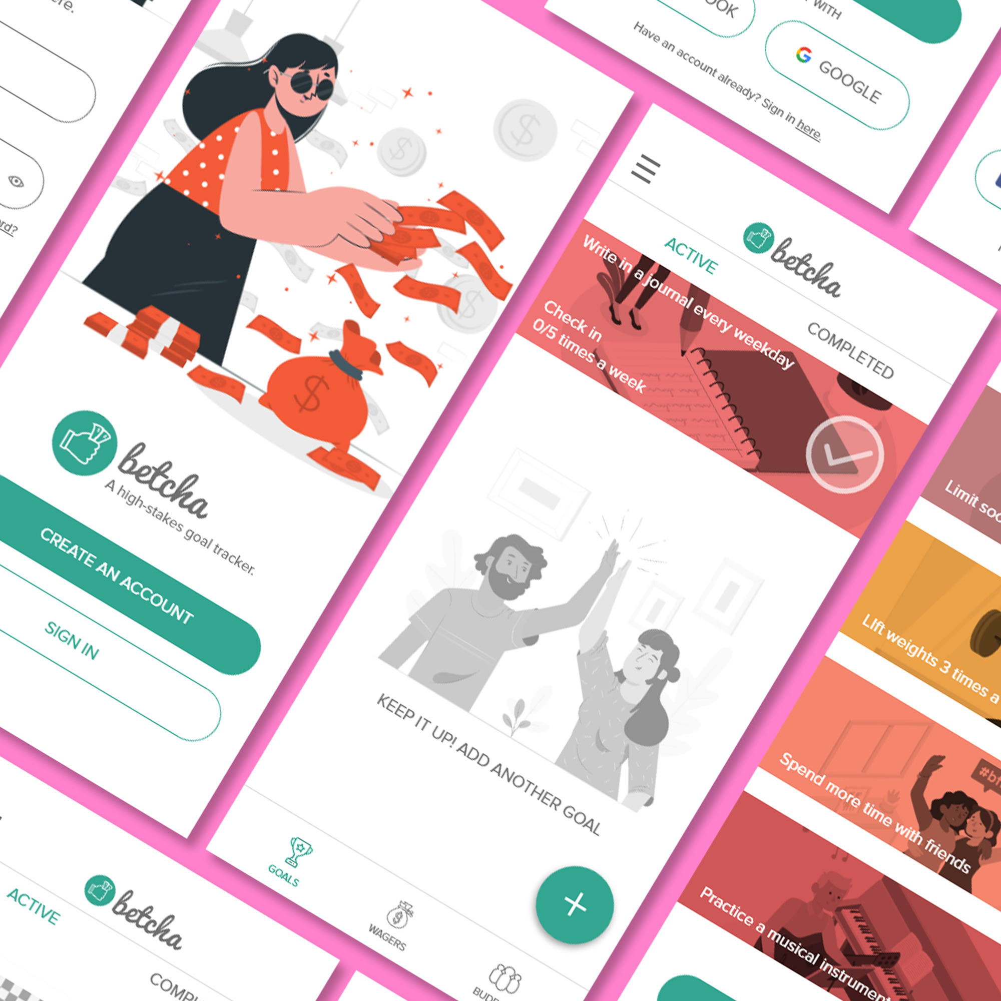
DESIGN
I researched apps that had a minimalist design theme on Pinterest and Dribbble, as I knew I wanted the app to have a similar feel. I wanted the app to be colorful and pleasing to the eye, so I chose bright complimentary colors for the color scheme as displayed in the Style Guide, but made sure to keep the call-to-action buttons the same green color for consistency.
STYLE GUIDE

MOOD BOARD

MOCKUPS
The low fidelity mockups proved that I had many screens that were redundant. Users found some of the flows to be clumsy, but overall they accomplished the tasks given to them and offered valuable feedback.
I went back to remove some excessive screens, such as the check in page, and replaced it with the homepage where where the users could access all their goals easily at the same time.


TESTING
After finding 5 new users that fit our ideal user persona (social, tech-savvy individuals who actively take part in self-improvement), we met over video conferencing to perform a series of tasks once which included:
- Creating an account
- Signing in
- Creating a goal
- Inviting a friend
- Editing an existing goal
RESULTS
From our usability testing sessions, we could conclude that our users thought:
• The colors were fun, and so were the illustrations
• The sign up, and login flow made sense
• The habit creation task was logical but there were minor issues like editing details of the habit was clumsy
They found the idea fun, and would use this app to keep themselves and their friends accountable!
FINAL THOUGHTS
Users have expressed interest in seeing interactive features like messaging and a leaderboard, all possible additional features that may create a more engaging experience in the app and ironically, require users to spend more time in the app itself.
It's interesting that the app became something very different than planned. I wanted a product that warned users about social media and phone usage. But upon helping them create a phone detox goal, I ended with a colorful gambling habit tracker.
It still addressed the issue of social media addiction, but in a more general sense of building healthier habits and having fun with some friends while doing so.
Chances are, once the app gains traction, the app will continue to veer towards that different direction, which goes to show the importance of remaining flexible and adapting quickly. It's one of the biggest lessons I learned in this case study and definitely look forward to learning more as the idea grows and takes flight.