CITYPUPS
Challenge: create a website that connects those who live in the city to their ideal adoptable dog.
Deliverables: High-fidelity mock-ups, prototypes, user testing
Roles: Research, Design, Testing
Shelters have been seeing a lot of successful adoptions since the beginning of the pandemic. However, many adoptions favor suburban applicants, especially those with large backyards in remote areas. This makes adoption for city folk more difficult as they have more particular requirements for the type of dog they’re seeking.
CityPups is a new startup that wants to match city folks with their perfect dog. They aim to create a website that will help users find a dog that will fit their requirements.
To reach a potential solution as quickly as possible, we’ll be running a design sprint, with me as the researcher and the designer.
PROBLEM: TOO MANY SITES, TOO MANY PROCESSES
The sites all show different information about the dogs, and they all have different interview processes and adoption application forms to fill. The information about the adoptable dogs are not always transparent, so the adopter may not know if the dog is a good match for their lifestyle when applying. The adoption process can be time and effort consuming, and increasingly frustrating.
This leads to our question:
How might we help city folks easily find and apply for their ideal adoptable dog online?
We created an ideal map of the end-to-end user experience to illustrate what we want:

RESEARCH
We interviewed a few city people about tools they used to adopt a dog. After compiling the highlights of the interviews together and organizing them into online post-it note clusters, we could see some patterns emerge, including the need for specific dog information, adoption information, and common pain points during the research process.

From the interviews, I could conclude a few common points.

As a user, I want:
- specific filters for the dogs (activity, size, health)
- more videos and photos of the dog
- an easier and more efficient application process
COMPETITIVE ANALYSIS
ADOPTAPET.COM

Adoptapet’s filters on the sidebar were a good addition, but according to the user interviews, they didn’t seem to be specific enough as our interviewees expressed interest in knowing activity level and specific living space requirement upfront.
Pros
• So many pictures!
• Favorite dogs feature
Cons
• Filters weren't specific enough
• Needs filter by activity level, living space
• Links externally to different shelters for more info and to apply to dogs
• Bio for each dog is not a consistent format between dogs
ASPCA.ORG

ASPCA only had two filters, age and gender. Their individual dog profiles also included only a few basic facts about the dog, like breed, gender, age, and then likes and dislikes, followed by a creative biography of the dog written by the staff that lacks specific easy-to-scan information.
Pros
• Very clear pictures of dogs, has a gallery per profile
Cons
• Dog profiles lacked detail
• If there is detail, it's organized not in filters but just listed as a paragraph or bullet list
• Search results needed a better grid display, scrolling is frustrating
PETFINDER.COM

Petfinder seemed to follow the same pattern of filters on the left side, but again they lacked the specificity that our interviewees wanted. The “favorite” option was a good addition as it allowed you to compile a list of possible adoption candidates for you to narrow down your choices.
However, once you click onto a dog, their profile can sometimes be scarcely filled out, leaving you to contact the shelter for more details and adding extra steps to the adoption process.
Pros
• More search filters than other sites
• Large clear photos that can be expanded
Cons
• Dog's bio is inconsistent across profiles
• Lack of details for each dog profile
• Lack of filters for dog search
• Leads to individual adoption site for adoption application and more information
Based off the pros and cons of each site analyzed during competitive research, I jotted down possible critical screens of the website we would be creating for CityPups. I knew it would have to include more search filters in a more accessible manner, as well as more specific details about the dog in their individual dog profile that would help adopters find their perfect match even before calling into the shelter to ask for more information.
I also wanted to include a favorites list as it was a good feature on competitor’s sites. I did notice a lack of transparency for adoption applications, so I wanted to include an adoption application progress screen so that the user can monitor what stage their application is in, and what else they need to do.
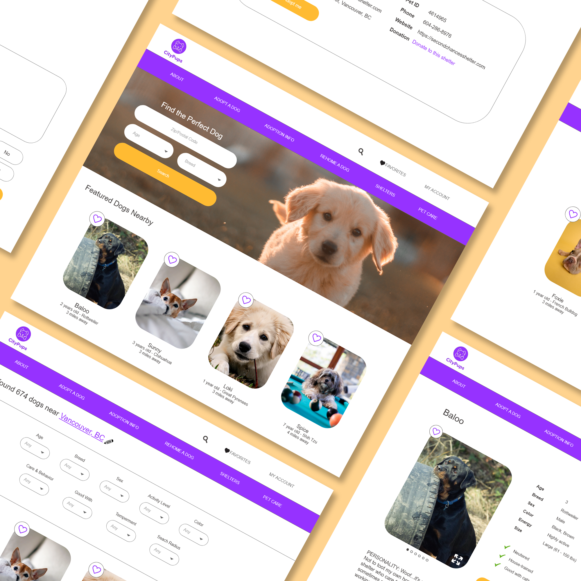
FEATURES TO INCLUDE
- Favorites list
- Same adoption form for all profiles
- Adoption form status
- Very specific search filters: activity level, health, living space requirement, temperament
- Dog videos
Our research showed that city residents wanted to find adoptable dogs close to them so that they could arrange transportation for the dog, so our critical screen would start with the user entering in their postal/zip code first.
The next screen would be the results of the dogs nearby, along with a list of filters that they can apply to narrow down their search.
The final screen will be the filtered search results of dogs that would fit their lifestyle and compatibility.
STORYBOARDS

I visualized my own experience with seeking an adoptable dog to fit my lifestyle, as well as taking into consideration all the highlights from the user interview sessions. It usually starts with a search engine, clicking on a few different sites, and then trying out each one to see the dogs available. Ideally, they’ll be able to find CityPups within the first page of Google.
After putting in their postal/zip code, they’ll find dogs nearby, then they can refine their search results by adding in additional specific filters like activity level, size, training requirements, personality, etc.
Selecting a dog’s photo will lead to their profile with more information, and an application form that will be standardized across all the dogs listed on the site. They would be also able to save their application form answers so that they can use it to apply for multiple dogs.
MOCKUPS


FEEDBACK
These five people were either knowledgeable dog owners, or dog lovers with the capacity to adopt a dog in the future. They were all tech-savvy, young (under 35) individuals with internet access, who lived in apartments or shared a home with roommates in the city.
I scheduled them in for video interviews in a day and they walked me through their thoughts as they reviewed the CityPups screens.
SAMPLE INTERVIEW QUESTIONS
• How was the experience of using CityPups to find a suitable dog?
• How easy or difficult was it to navigate?
• What frustrates you about using CityPups?
RESULTS
• They’d like to see more/less of particular filters for dog search results
• They were uncertain of the placement of pictures on the dog profile
• The layout was still a bit big and too spaced out due to my initial design flaw
• There was too much scrolling to get to where they wanted (ultimately the users preferred having more prominent dog pictures and videos, instead of text).
FINAL THOUGHTS
This was an extremely quick and efficient way of getting a prototype out there and into the hands of users. I would’ve liked the prototype to have clickable routes for the user to explore but this was cut due to time constraints, and I would love to see a refined version of the website's layout as there are many spacing issues, but I was still able to get valuable insight about the current design based on viewing the mockups alone.
Next steps would be to move onto Version 2 of the mockups and update the prototype based on the interviewees’ list of identified weaknesses and strengths. I'd like to go through a second round of testing after refining the mockups and making the prototype interactive, instead of just a review of the screens.
What I learned from doing the design sprint was how to not pick at a deliverable until it is perfect. Because time was extremely limited as I needed to meet deadlines day by day, I needed to apply the principle that done is better than perfect. While I'll always have my habit of tweaking a design until I'm happy with it and spending more time than necessary, I've learned to pick and choose my battles going forward.