CREATIVE.COACH
Challenge: design a website specifically for creative instructors to deliver their lessons, assignments, and feedback to their students.
Deliverables: wireframes, user research, user testing
Roles: Research, Design, Testing
In this project, the client had a very broad, unstructured idea to create an all-inclusive learning and coaching platform for creative instructors (called Creative.Coach). There are a few platforms that already specialize in delivering educational content and courses, but the client wasn’t happy with the features that were included.
They wanted an education delivery platform that had the built-in ability to offer and schedule coaching and feedback sessions, and host feedback videos for critiquing homework or answering frequently asked questions.
COMPETITIVE ANALYSIS
These sites offer online courses, membership sites or coaching: CoachAccountable, Teach:able, Coach.me, and Kajabi. These sites were rated on 4 different heuristics from the Nielsen Norman Group UX principles, on a score from 1 to 5.

In summary, out of the four platforms, Kajabi and CoachAccountable were the most robust, with the most features and ability to deliver or customize courses, and arrange coach calls right within the platform. Teachable is a good course delivery site but lacked the level of customizability that the previous two platforms featured, and didn’t have appointment scheduling or calls. Coach.me was the cheapest option, but had the least amount of tools as they didn’t offer courses at all.
After analyzing these course delivery platforms, I had a better idea of what was already out there, and how we could improve what was already existing. Many of these platforms suggested using external tools such as calendly.com to schedule calls with your coach or instructor, and then the calls took place on Zoom or Skype. None of the sites had a feature to deliver notes or feedback about submitted assignments.
PERSONA
I created two personas of our ideal users that would benefit most from using this site:

One of our user personas would be a young, tech-savvy photographer hobbyist who enjoys learning online, however needs the individual feedback to help him progress in improving his skills.

Our second user persona would be a tech-savv creative professional (painter, photographer, designer, etc.) looking to earn extra income to deliver courses online.
Having a very open-minded client with nothing but a concept in mind has its ups and downs. It was nice having the freedom to ideate, create, and design based off my own research. However, this meant that while I was designing, I was left with making some decisions that I didn’t know would be necessary for the client. Did the client want analytics, email marketing, or landing pages to be included in the website features? How much customization would they want available for the instructors? I referred back to the client and they confirmed they were primarily concerned with one-on-one coaching sessions in addition to content delivery, so I knew my wireframes would concentrate on showcasing those features.
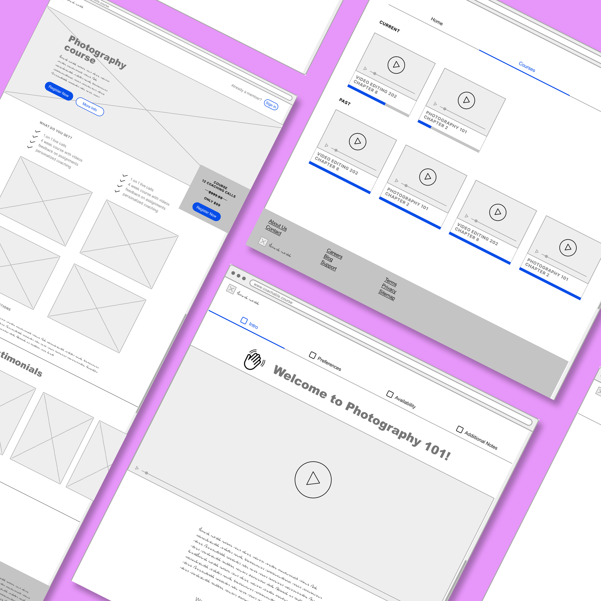
The first iteration of wireframes were extremely basic. There was a signup/login page, with some courses listed in a linear fashion, modeled after Teach:able.
However, upon further research on other course delivery sites like Linkedin Learning, Skillshare, and Udemy, I went back to the wireframes and incorporated their designs in the second iteration. I made sure to include the ability to schedule coach calls and have a place for the student to upload their homework, and a place for the coach to deliver their pre-recorded feedback as requested by the client.
WIREFRAMES


In the end, the client was really happy with the work so far and was glad to have his idea visualized. It helped him ground his idea further and understand what was possible, and what could be improved.
FINAL THOUGHTS
Even though I had completed and delivered the wireframes to the client and they were quite happy with the work, I still had ideas about how to improve the layout with future iterations. I felt like the intake form could have looked more modern in terms of design, and there could have been more image placeholders or a gallery feature to show off students’ or instructors’ work if it was a site for creatives.
It would’ve been nice to go through a third iteration of wireframe revisions to include these features if I had another week, and I may revisit the wireframes another time should I run into that client again.
In these four weeks, I learned that research and interviewing the client to get specifics is key. Even though I thoroughly investigated the four coaching sites before diving into design, I had a lot of questions and uncertainty still lingering. I would ask for more specifics going forward when communicating with clients who have a high-level idea of what they’d like to see, and I would allocate a few more hours of my time to explore similar sites on different users’ views going forward.