UX/UI DESIGN, RESEARCH
A new habit tracker with monetary stakes.
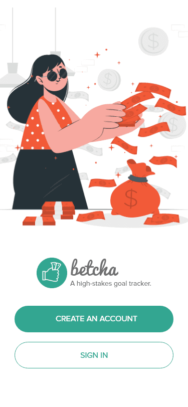

Users are starting to understand the addictive nature of our mobile smartphones, especially around social media apps. I wanted to research further into the social media addiction phenomenon to better understand it, and discover what types of tools were out there to help curb the addiction.
Background
I wanted to create a mobile app that would help unaware audiences understand the negative effects of social media addiction.
Problem Statement
Social media users need a better tool to curb their chronically online addiction.
I approached the task following these essential stages in development:
Define
Ideation
Iterations
Solution
SURVEY & results
I posted an initial screener survey on social media channels (Twitter, LinkedIn, Reddit, Facebook survey groups) in order to discover more about my potential users.
A summary of the responses:
77 responses
43.6% spend 2-3 hours a day on social media, and 25.6% spend 4-5 hours
Most popular channels:
35.9% - Youtube
26.9% - Instagram
41% said social media is good entertainment, and 21.8% said it made it easy to stay up to date with news and trends
41% agreed the biggest problem with social media is the spread of misinformation

User Interviews
I held one-on-one video conferences to interview a select few survey takers for more details. A few of the interviewees:

After asking about their interactions online, their preferences in content, and usage of social apps, all three interviewers expressed the same few sentiments:
All interviewees feel they should spend less time on social media
All of them take measures to detox occasionally (going outside, keeping phone away, distractions)
Feelings range from overwhelmed, to feeling “nothing” or are indifferent when they are scrolling
Affinity map
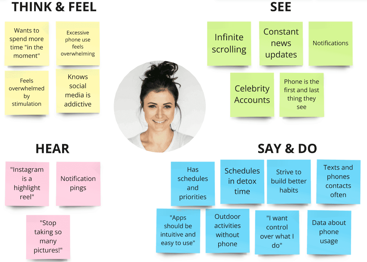
I organized highlights and quotes by interviewees in post-it notes, which then was re-organized once again by clustering highlights by topic (e.g. feelings, opinions, solutions). The highlights were digitized for clarity in an affinity map.

I organized highlights and quotes by interviewees in post-it notes, which then was re-organized once again by clustering highlights by topic (e.g. feelings, opinions, solutions). The highlights were digitized for clarity in an affinity map.
user story
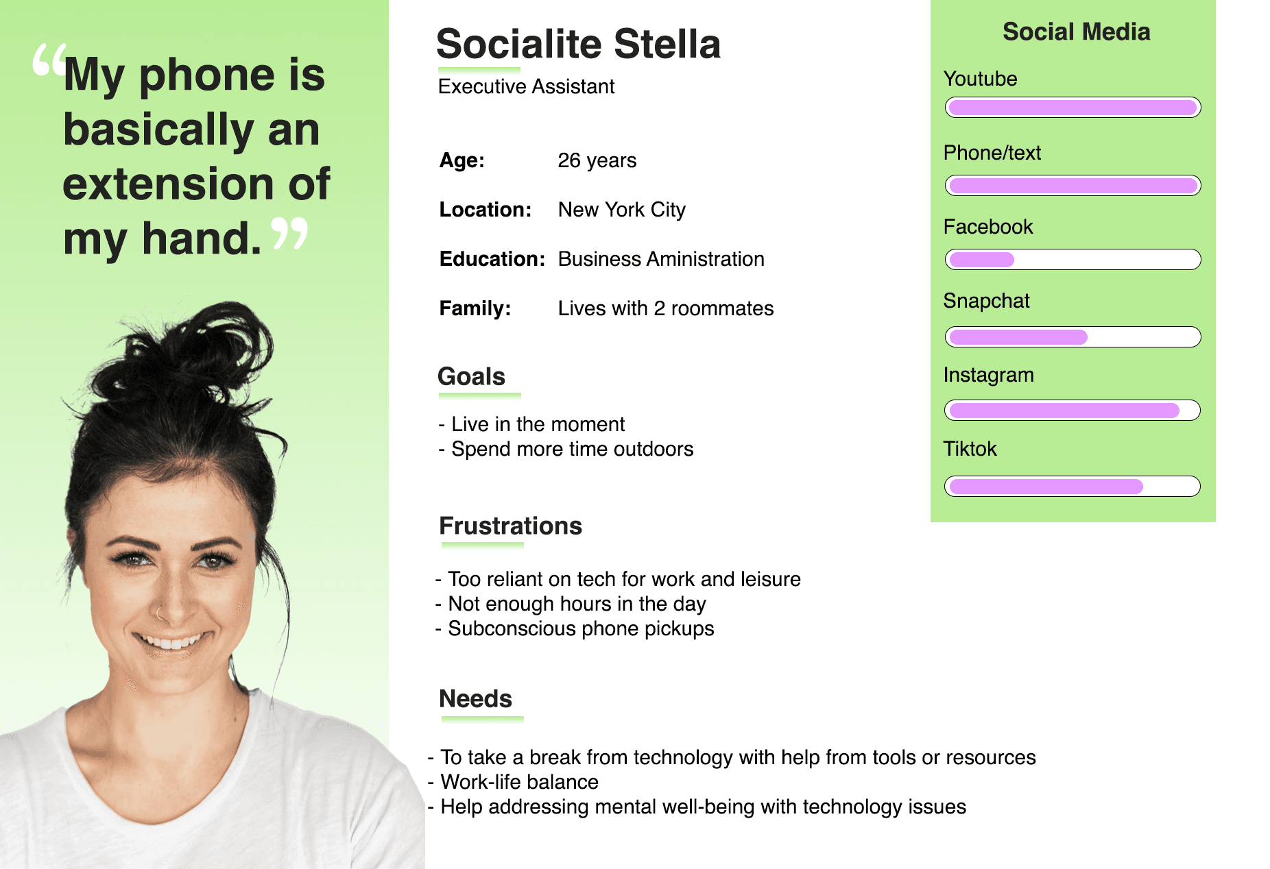
Based on the research results, I wanted to get a better idea of what function I wanted this app to serve, and who that would help the best. I wrote a few user stories and created a persona that could keep the end goal in mind while I was developing the app.

user Persona + Empathy map
Heuristic Analysis
I downloaded other screen time apps to see how other people were succeeding, and failing, at solving this problem. I chose three apps that had high ratings in the app store, and also had a high number of downloads.

Similarities:
These apps track your usage and present data in easy-to-read charts
They offer gamification to incentivize following rules and building a habit
They all include a challenge/goal feature for the user to reach
Revenue from subscriptions: Average $4-8 per month or $30-60 per year
Site map
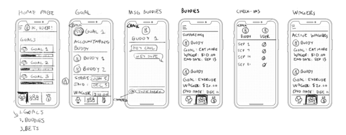
In the first step of the ideation process, I created a site map to guide me through what would be included in the app.
I initially had more features in the app such as Messaging, and a Home page, but after running through a few ideas with other designers, I ended up removing those features for lack of time.

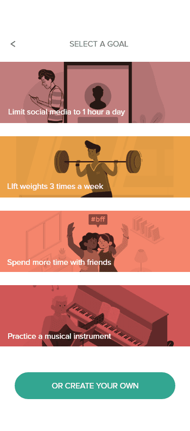
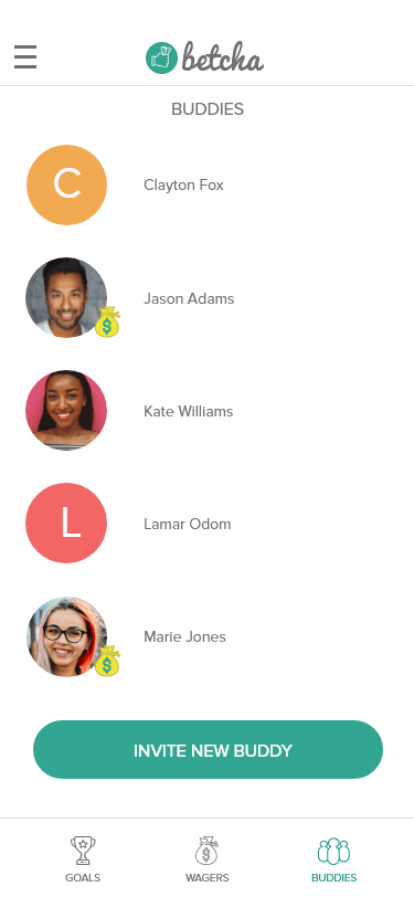
user flow
I created three flows that would help visualize the different paths that the user could take when they have the app in front of them.
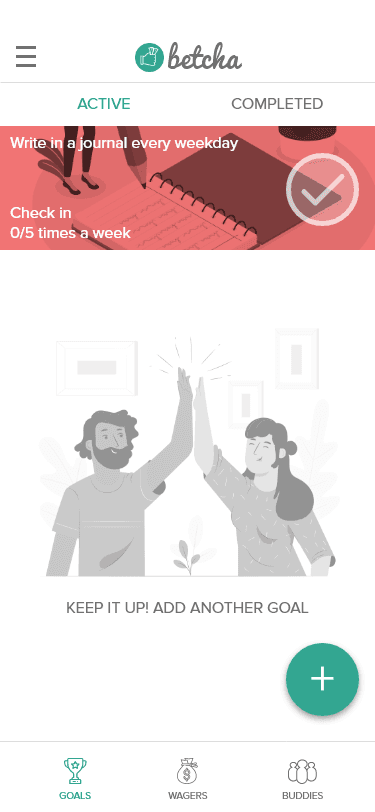
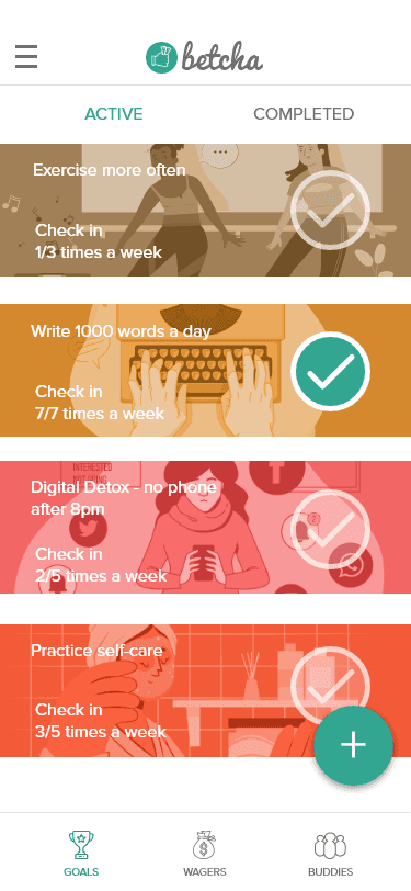
The user flows illustrated the paths for:
Signing up for an account
Inviting a buddy to the app
Creating a goal

I started with pencil wireframe sketches so that I could see what translated well and what needed improvements.
Prototypes
I showed these wireframe sketches to 5 people via online video conference for their review.
A few key points from the interviews were:
The navigation icons were confusing and needed further clarification
There should be more images
They were eager to see it in better mockup screens.
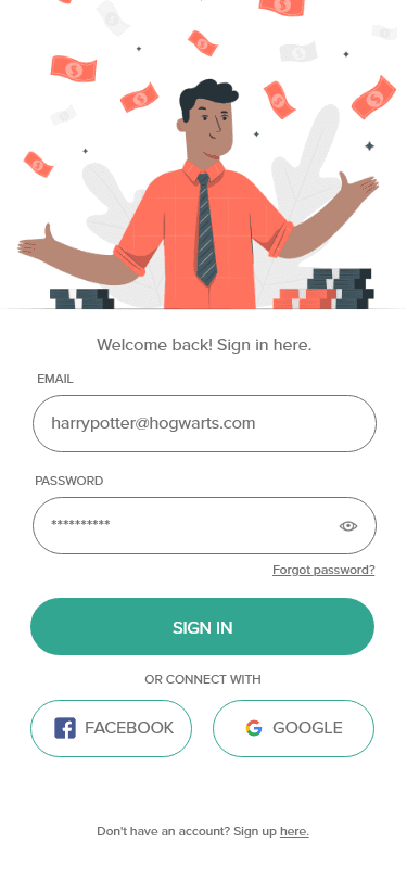
With the low fidelity mockups, I created a clickable prototype. Testing out the prototype earlier on would allow me to iron out the flaws in design and features before moving onto high fidelity, branded mockups.
I scheduled in video conference interviews with another 5 new users to get their unbiased feedback on the prototype.
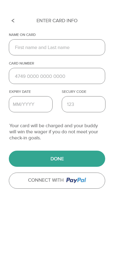
Users were given a few tasks to complete:
Sign up for an account
Create a task
Invite another user
Through the initial usability testing phase, I learned that the layout of the app could use improvement. People were having trouble finding where to click and where to look when they wanted to invite another user, so I tested different button placements and spaced out the labels on clickable widgets so it was easier to read.
I ran the wireframes through several video conference usability tests, which proved positive results. People could accomplish their tasks, they felt good about what they were seeing, and offered helpful tips like adding in more labels and tool tips for hints and clarity.
Style guide

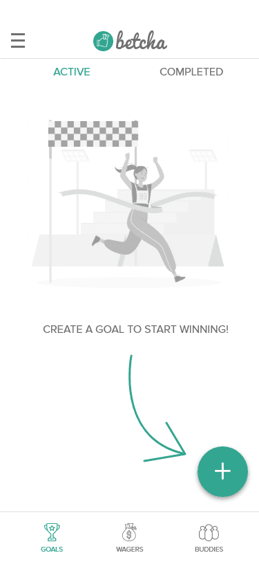
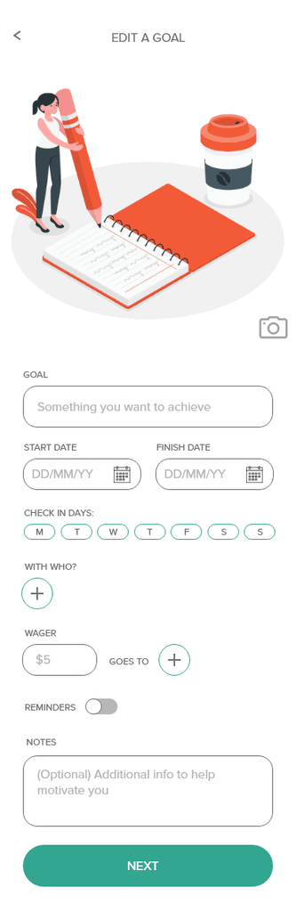
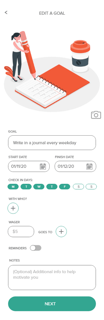
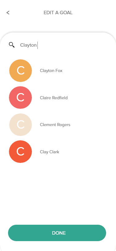
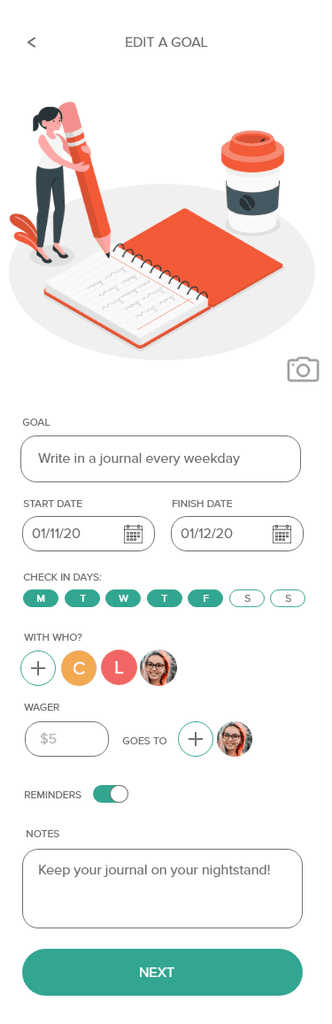
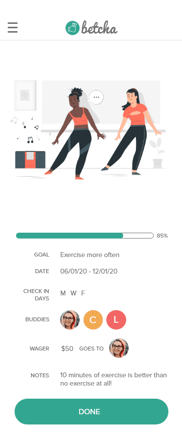
I held usability testing sessions for mockups. Seven users had a series of tasks to perform: creating an account, signing in, creating a goal, inviting a friend, editing an existing goal. These are the common feedback points shared by the users:
Visually compelling
Users reported enjoying the illustrations and colorful components, and found that it made the experience delightful
Logical flow
Users were able to sign up and log in successfully, with none of them abandoning the task or taking more than a few seconds to complete.
Fine-tuning needed
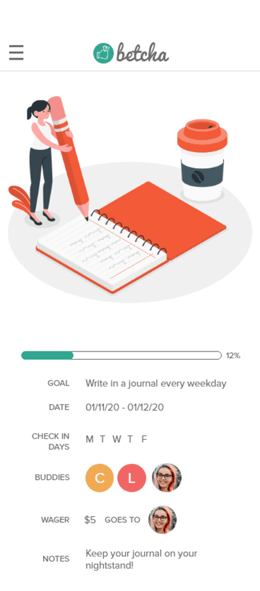
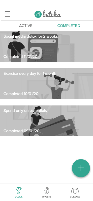
The habit creation task was simple but users found tasks like editing goal details to be clumsy.
Users expressed interest in seeing interactive features like messaging and a leaderboard, all possible additional features that may create a more engaging experience in the app. Next steps would be gathering further feedback from a larger audience, and if the app were to be built and live, then I could review the effectiveness of the app through usage.