UX/UI DESIGN, RESEARCH
Seamless digital banking experience for mobile and web.

I joined Celero as a UI/UX designer as one of 2 designers on the Xpress team. I supported the design across every aspect of the online banking product and was responsible for leading UX and UI across the application side of the platform.
Background
Xpress is a retail digital banking platform for Canadian credit unions. The solution includes public website, online banking, and mobile app capabilities for personal, retail, and small business clients.
Current credit unions that use Xpress online banking for their mobile apps and web platform include: Assiniboine Credit Union, Synergy Credit Union, connectFirst Credit Union, and more.
Problem Statement
Canadian credit unions need a better online banking platform for web and mobile that ensures a seamless client experience.
The process at Celero is a systematic approach with the goal of creating a intuitive user-centric experience for the credit union members. Here is the breakdown of the essential stages in the process:
Define
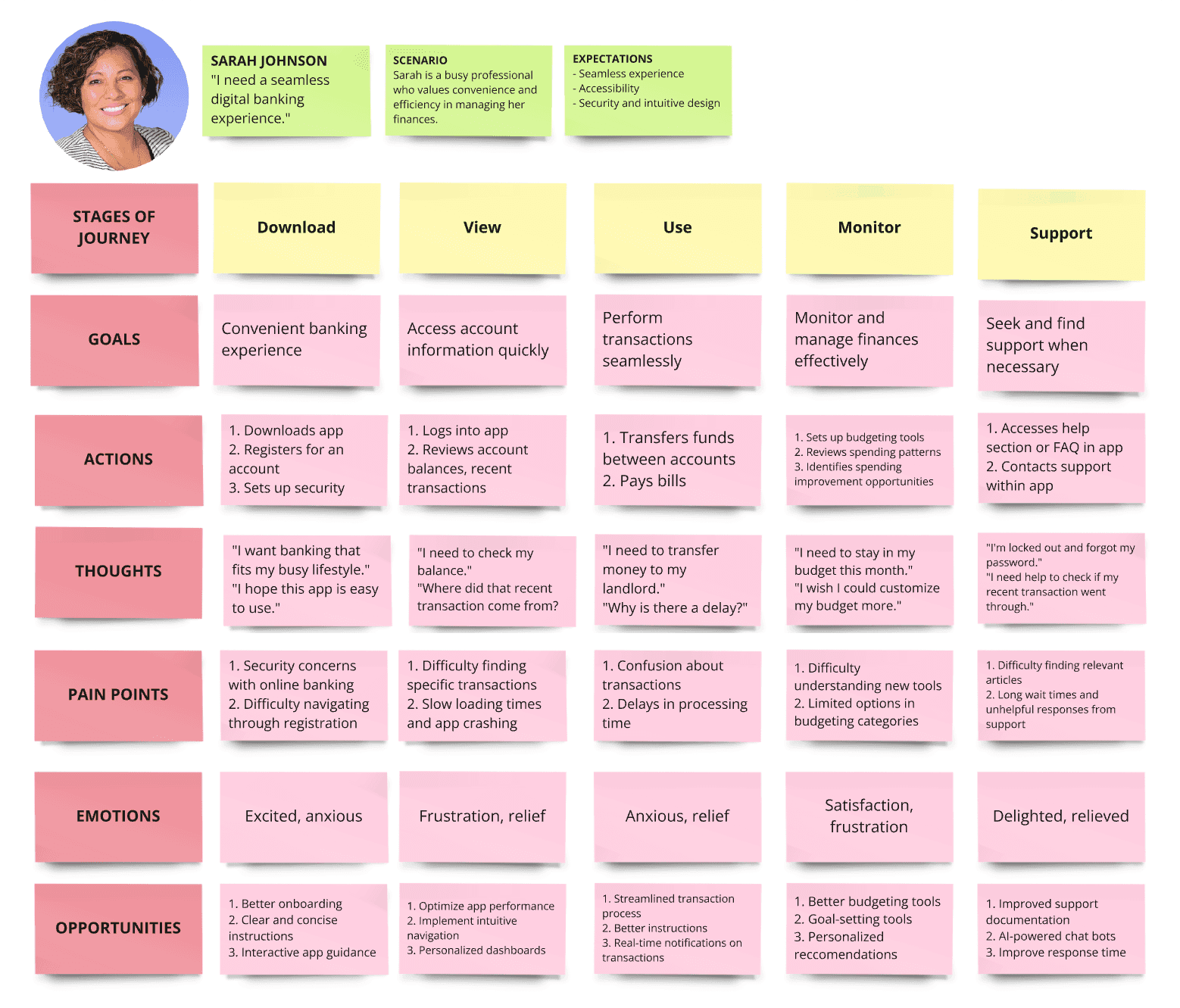
Journey Map
User Personas
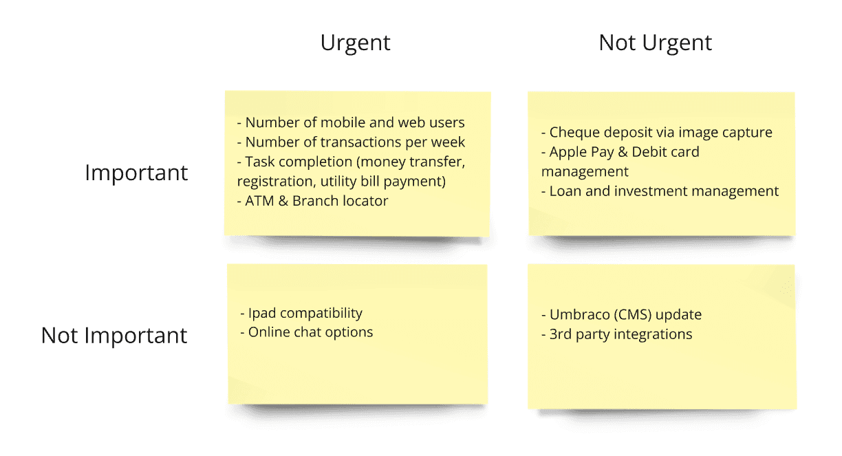
Success Metrics
I conducted web conference interviews with key stakeholders, namely tech and support staff, as well as credit union management. End user interviews and open discussions were also held to understand how they would use Xpress digital platform on the web, or on mobile.
Competitive Analysis & Results
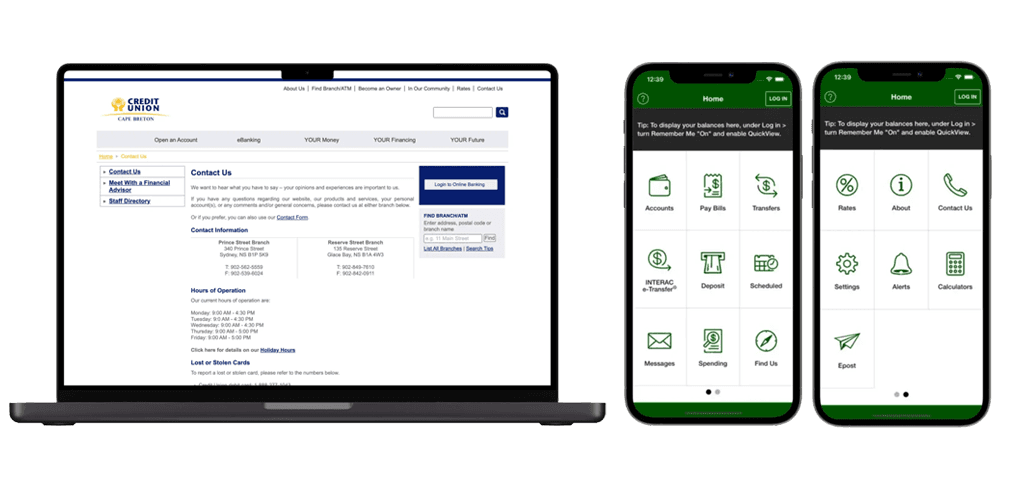
I researched their current banking platform (Member Direct), and interviewed the credit union team as well as business stakeholders about what pain points they were experiencing in their current workflow.
Member Direct: Usage Statistics
28% transactions were account transfers (80% between accounts)
46% were utility bill payments
21% were credit card payments
1.2% were international fund transfers
80% of users logged in only to check account balances
7.5% of utility bill payments were made via web
92.5% of utility bill payments were made via mobile app banking
User Pain Points
Too many steps for payment transfers and authentication
Complicated registration process
Too frequent app updates
Not enough features
Business Stakeholder Pain Points
Low web and mobile app usage
Difficulty adding new features and services due to old tech stack
Members still relying on in-person branch visit
With the results, we defined the problem, the users and their behaviors through ideation workshops with stakeholders, and presented them as user personas.
"I am a credit union member who wants to register for mobile banking, but the process is too complicated and frustrating."
"I am a small business owner. I want an easy way to e-transfer money to vendors for my business, but it won't let me verify the transaction."
Personas
User Journey
Working with the marketing and the product team, we identified the urgent and the non-urgent features that would define the success of the new banking experience to be included sooner, and what would be included at a later date.
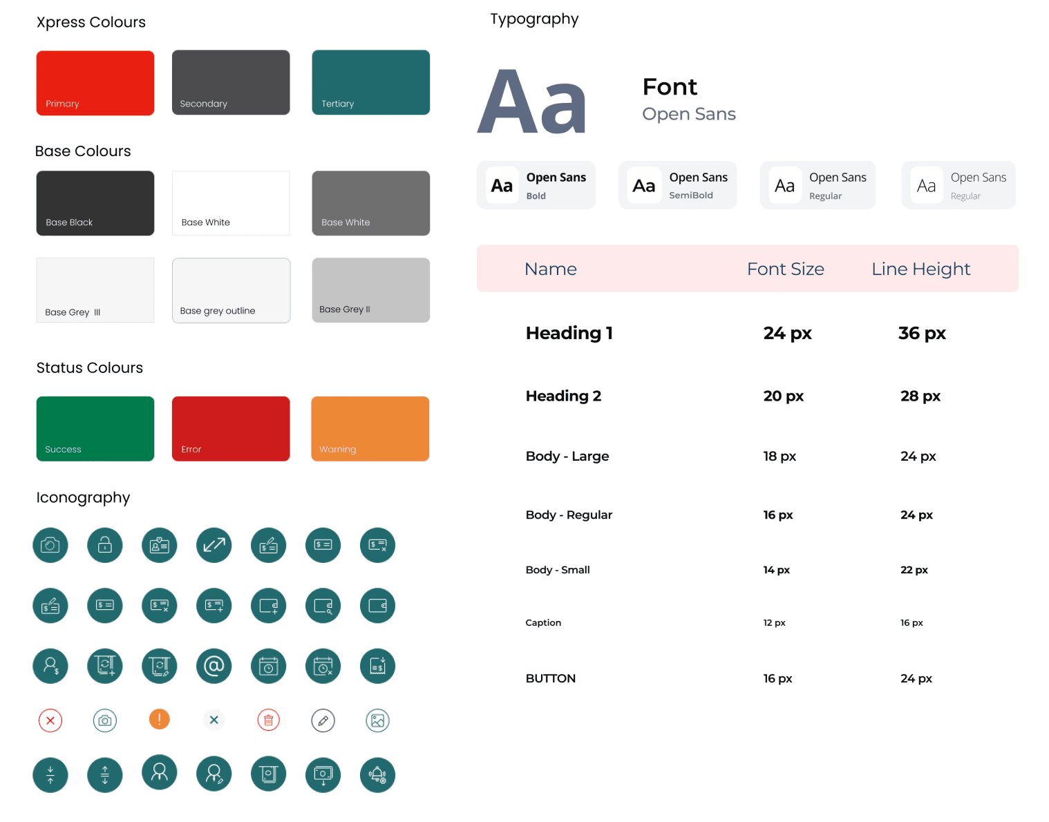
Once the ideation process was completed and features were locked down, we designed a style guide to ensure we adhered to branding and to better outline to credit unions how their own branding would apply to the product.
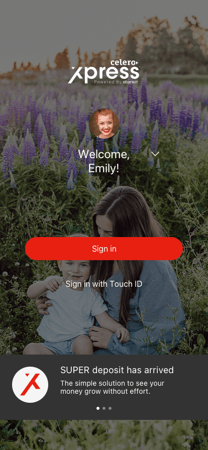
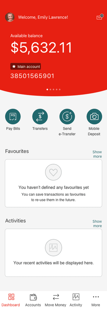
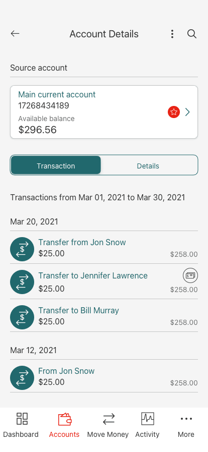
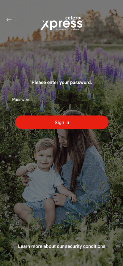
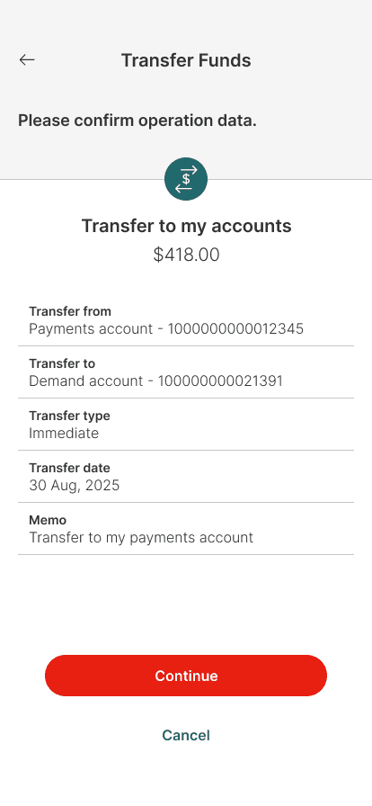
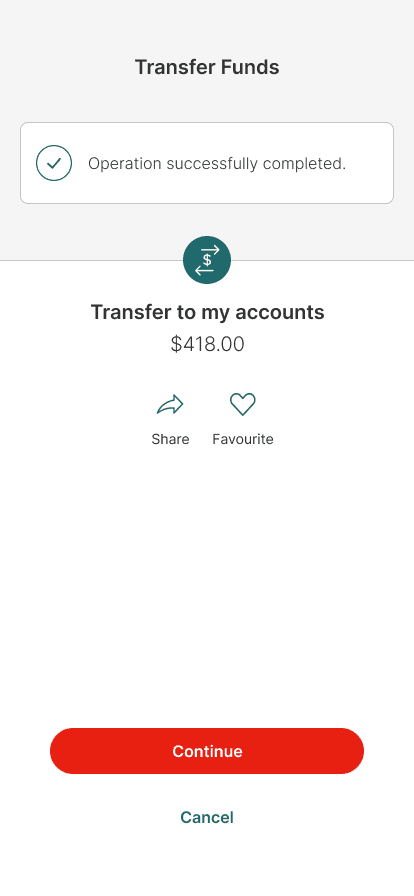
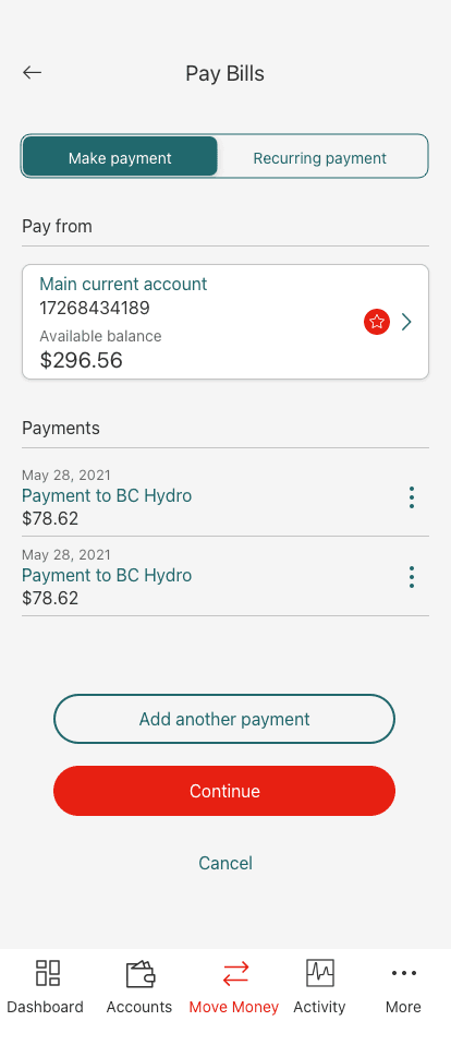
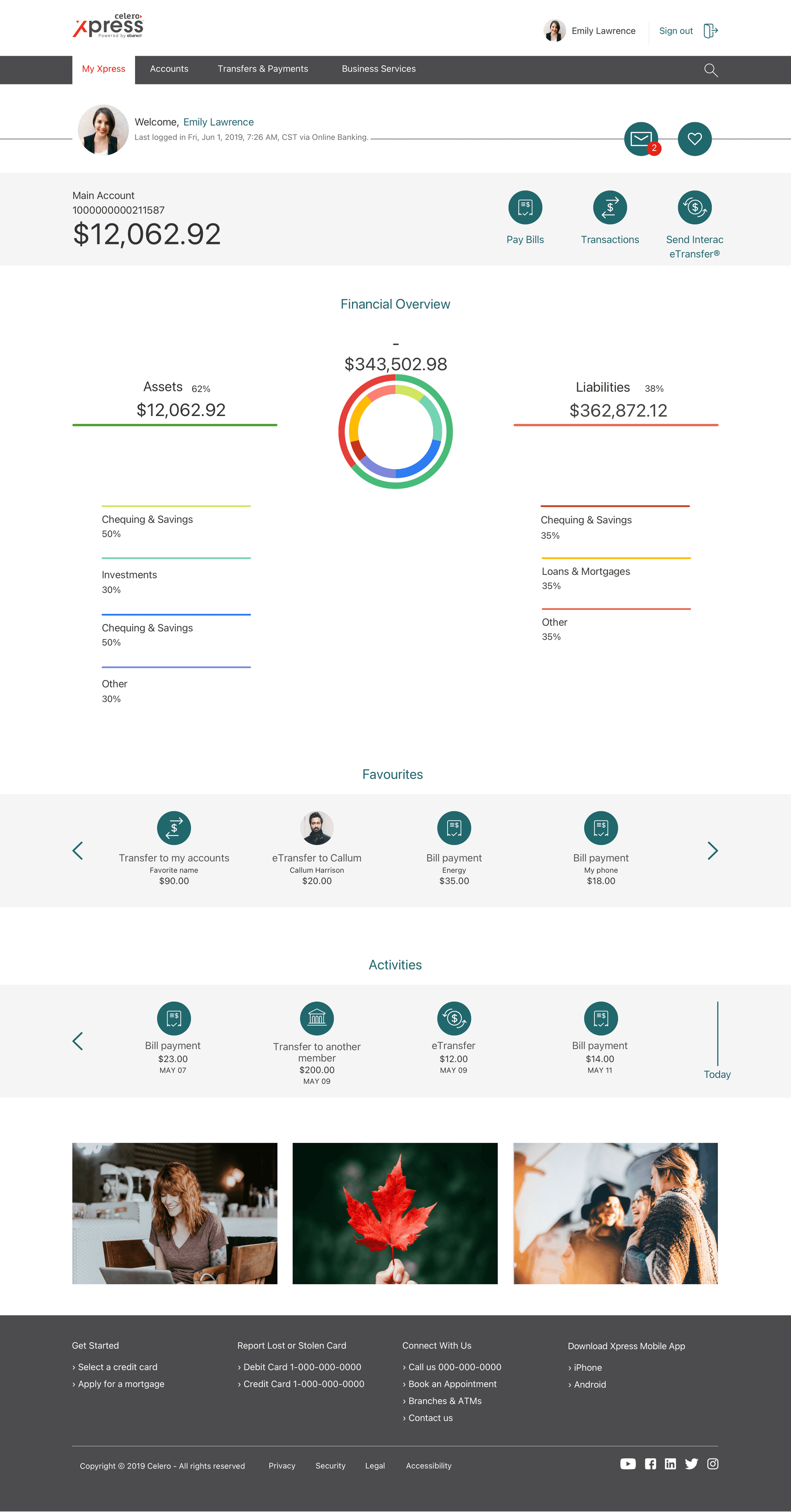
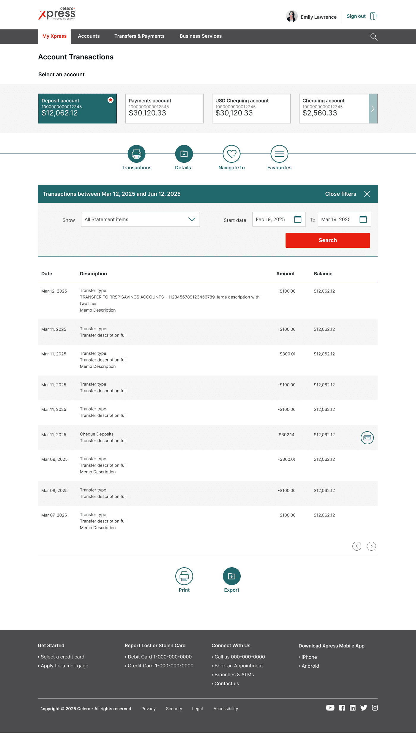
We created hi-fi web and mobile mockups of the final design solution that would include the key processes, such as signing in, transferring funds and paying bills, and viewing the home page dashboard.
Mobile App Mockups
Web App Mockups
Outcomes and achievements of the project were measured during the usability testing phase, including user feedback, user reviews, transaction errors, and adoption rates.
We concluded the following insights:
Increased Efficiency
Stats reported 70% less errors rising from account related transactions, and 50% less task completion drop-offs.
Increased Usage
Number of transactions increased by 8%, and number of mobile/web app users increased by 10%.
Increased Satisfaction
Customer satisfaction score increased by 90%, as reflected in Google Play and Apple Store ratings as well as client surveys.
Reflection
Xpress is now used as the primary banking platform for 30+ credit unions across Canada. We implemented each credit union's branding onto the solution and worked with their marketing teams to ensure a seamless transition from their old platform to the new and improved one, offering additional branded features such as public website, web online banking, as well as Android and iOS mobile apps.
Implemented a design process and workflow. This has helped our team establish more structure to how we conduct our work and allow other teams to gain visibility across our upcoming sprints.
Establishing a branding guide. This has helped to maintain consistency in the look and feel across different parts of the platform.
Creating a design system. This helped collaborating teams understand how and why we choose to implement certain components over others.
This project is ongoing, subject to continuous improvement of the back-end as well as front-end features based on user feedback, analytics, and emerging technologies.
Our next steps on the Xpress product is continuing the conversion of the online web platform to meet accessibility guidelines, and using best design practices to ensure accessibility for all users.
